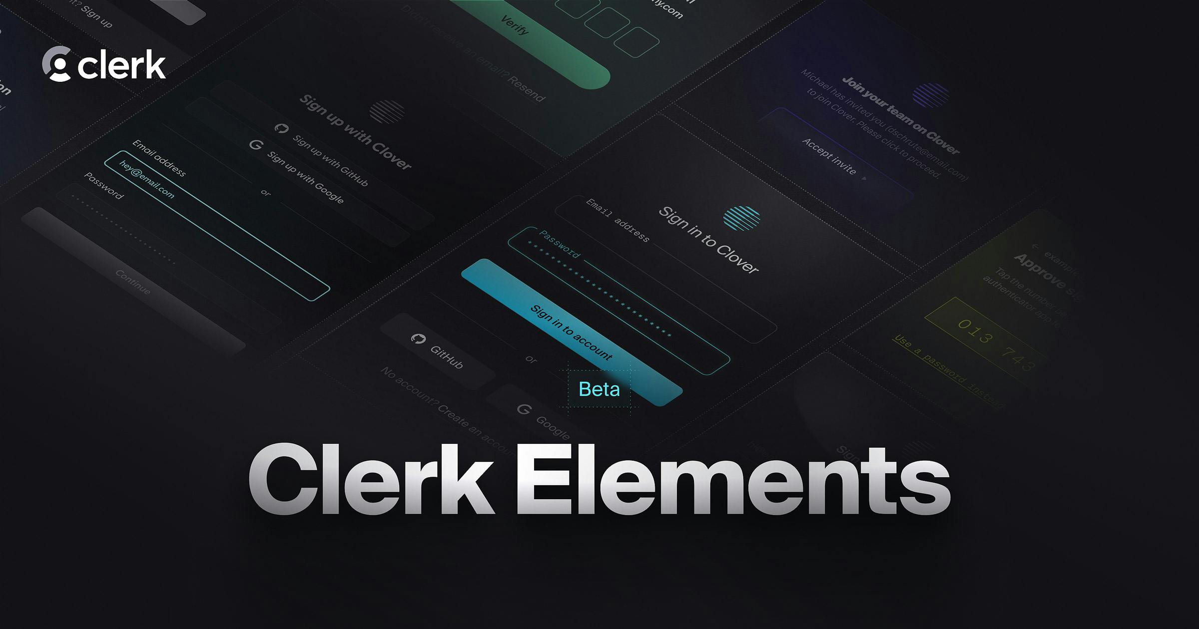
Clerk Elements (Beta)
- Category
- Components
- Published
Introducing Clerk Elements, a new set of unstyled UI primitives that make it easy to build completely custom user interfaces on top of Clerk's API.

Our pre-built UI components are a phenomenal way to integrate Clerk's authentication and user management features into your applications, but we know that many of you are looking for even more customization. That has usually meant dropping down to our hooks to create custom flows. Clerk's hooks offer a ton of flexibility and control for creating flows exactly as you want, but we think we can make it easier for you to focus on building your UI while letting us handle the underlying logic.
This is why we're excited to introduce Clerk Elements (Beta). Clerk Elements is a collection of composable components for creating completely custom authentication and user management UIs on top of Clerk's APIs and business logic. We think the component is a great abstraction, and so we're taking it a step further and exposing an unstyled set of components that you can use to build your authentication UIs to completely match your brand and existing design system.
Clerk Elements is launching in beta today, with support for building fully custom sign-up and sign-in flows inside Next.js. Along with the release, we're also sharing documentation and examples to get you started with Clerk Elements.
Build with Clerk Elements
They say a picture is worth a thousand words (and a component is worth 1,000 APIs), so let's dive right in. Below are examples of unstyled sign-up and sign-in flows built with Clerk Elements. These snippets support authenticating with Google auth, or email and email code.
Build your sign-up
'use client'

import * as Clerk from '@clerk/elements/common'
import * as SignUp from '@clerk/elements/sign-up'

export default function SignUpPage() {
  return (
    <SignUp.Root>
      <SignUp.Step name="start">
        <h1>Create your account</h1>
        <p>Welcome! Fill in the fields below to get started.</p>
        <Clerk.GlobalError />

	      <Clerk.Connection name="google">
	        <Clerk.Icon name="google" /> Sign up with Google
	      </Clerk.Connection>

        <div>or</div>

        <Clerk.Field name="identifier">
          <Clerk.Label>Email address</Clerk.Label>
          <Clerk.Input />
          <Clerk.FieldError />
        </Clerk.Field>

        <SignUp.Action submit>Continue</SignUp.Action>
      </SignUp.Step>
      <SignUp.Step name="continue">
        <h1>We need a few more details.</h1>
        <Clerk.GlobalError />

        <Clerk.Field name="firstName">
          <Clerk.Label>First name</Clerk.Label>
          <Clerk.Input />
          <Clerk.FieldError />
        </Clerk.Field>

        <Clerk.Field name="lastName">
          <Clerk.Label>Last name</Clerk.Label>
          <Clerk.Input />
          <Clerk.FieldError />
        </Clerk.Field>

        <SignUp.Action submit>Continue</SignUp.Action>
      </SignUp.Step>
      <SignUp.Step name="verifications">
        <Clerk.GlobalError />

	      <SignUp.Strategy name="email_code">
          <h1>Check your email</h1>
          <p>We've sent a code to your email.</p>
	        <Clerk.Field name="code">
	          <Clerk.Label>Email code</Clerk.Label>
	          <Clerk.Input />
	          <Clerk.FieldError />
	        </Clerk.Field>
	        <SignUp.Action submit>Continue</SignUp.Action>
	      </SignUp.Strategy>
      </SignUp.Step>
    </SignUp.Root>
  )
}'use client'
import * as Clerk from '@clerk/elements/common'
import * as SignIn from '@clerk/elements/sign-in'
export default function SignInPage() {
return (
<SignIn.Root>
<SignIn.Step name="start">
<h1>Sign in to Clover</h1>
<p>Welcome back! Please sign in to continue.</p>
<Clerk.GlobalError />
<Clerk.Connection name="google">
<Clerk.Icon name="google" /> Sign in with Google
</Clerk.Connection>
<div>or</div>
<Clerk.Field name="identifier">
<Clerk.Label>Email address</Clerk.Label>
<Clerk.Input />
<Clerk.FieldError />
</Clerk.Field>
<SignIn.Action submit>Continue</SignIn.Action>
</SignIn.Step>
<SignIn.Step name="verifications">
<Clerk.GlobalError />
<SignIn.Strategy name="email_code">
<h1>Check your email</h1>
<p>We've sent a code to <SignIn.SafeIdentifier />.</p>
<Clerk.Field name="code">
<Clerk.Label>Email code</Clerk.Label>
<Clerk.Input />
<Clerk.FieldError />
</Clerk.Field>
<SignIn.Action submit>Continue</SignIn.Action>
</SignIn.Strategy>
</SignIn.Step>
</SignIn.Root>
)
}Customize Elements
As you can see from the above snippets, Clerk Elements gives you complete control over the markup rendered in your authentication flows, and everything is unstyled. We want to make it easy for you to integrate with your existing styling approach. To that end, any markup that is rendered can accept a className prop. Bring on those Tailwind classes!
<SignIn.Action
  submit
  className="px-4 py-2 bg-purple-500 text-white shadow-sm"
>
  Continue
</SignIn.Action>
Clerk Elements also support the asChild prop, popularized by component libraries like Radix. Bring your existing component library and it'll take care of the rest.
<SignUp.Action submit asChild>
  <CloverButton>Continue</CloverButton>
</SignUp.Action>
For more information on the available components and how to get started building fully custom flows with Clerk Elements, check out the Clerk Elements documentation.
Building towards GA
While we're not marking Elements as stable quite yet, we're currently dogfooding it internally by building our existing pre-built components with Elements. As we do this, we expect to continue to make refinements to the component APIs to make sure we support even the most complex use cases.
Once our pre-built components are built on Elements and it supports all major React frameworks (not only Next.js), we'll be ready to mark Elements as stable and fully ready for production.
Your feedback is critical during this beta period to making sure Clerk Elements is the best it can be. If you have questions or want to talk to other users who are testing out the Clerk Elements beta, join the Clerk Community on Discord.
We're already having fun internally dreaming up new authentication UIs made possible with Clerk Elements, and we can't wait to see what you build!